Zocdoc Brand Refresh
Client | Zocdoc
Agency | Zocdoc Brand Studio
My Role | Design, Brand Style Guide, Brand Application
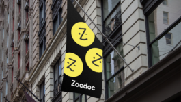
Zocdoc was in need of a major refresh from its old brand created in 2016. As a designer with brand design expertise, I joined their journey to help and guide the internal design team in building a refreshed brand system that is contemporary and unique, enabling it to stand out among its competitive landscape.
A year after the rebrand, brand awareness increased significantly by 30%, as measured by the number of searches for Zocdoc.

PREVIOUS LOGO
NEW LOGO
“We are so happy to move away from the potato head.”
The logo is often the first challenge in any branding project. While we were creating the moodboards and overall concept, I suggested making a few edits to the ‘Zee’ (the logo mark) to give it a more modern look. This simple step forward elicited passionate responses from throughout the company, as some stakeholders humorously remarked, “we’re so happy to move away from the potato head.”
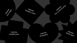
The shapes and patterns
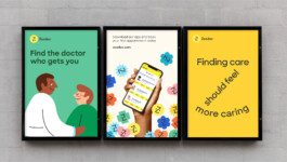
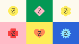
To maintain flexibility while establishing a visual discipline, I introduced six geometric shapes that are inspired by various aspects and aspirations of the Zocdoc brand. These shapes can be used in patterns and combined with other elements to enrich Zocdoc’s visual language.


The brand that can appeal to both patients and providers
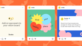
Zocdoc functions as a matchmaker between patients and healthcare providers, which requires the brand to appeal to both groups.
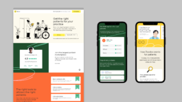
Before we began our visual explorations, we interviewed selected patients and providers to see what would be the ideal brand that they would like to communicate with and to be represented by. We figured that while the patients are usually more drawn to vivid images and concise headlines, the providers react better to thorough copy and minimal visual elements that adds to the professional and polished look.
The patient brand

The Provider brand
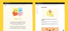
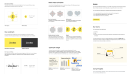
A more easily accessible online guideline.
I took a lead in setting up and writing the visual guidelines for our brand, as well as building the online guidelines using Frontify. These guidelines provide our vendors and stakeholders with easy access to our brand assets and ensure consistency in our branding across all channels.
online guideline Page examples (blurred for copyright)
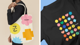
Brand in action
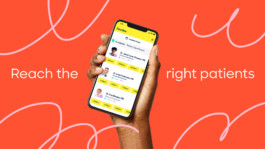
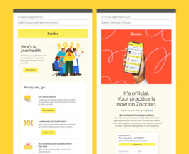
The best thing about being in-house is that you get to experience everything from beginning to end. I really enjoyed watching the Zocdoc brand I helped build go into action across numerous design applications.
Quarterly white paper
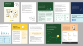
CRM for patients and providers
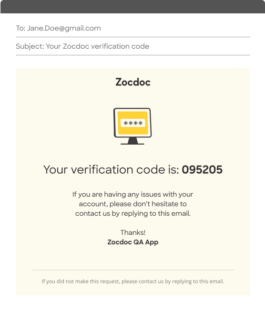
Transactional email
more design assets


Zocdoc Brand Refresh
Client | Zocdoc
Agency | Zocdoc Brand Studio
My Role | Design, Brand Style Guide, Brand Application
Zocdoc was in need of a major refresh from its old brand created in 2016. As a designer with brand design expertise, I joined their journey to help and guide the internal design team in building a refreshed brand system that is contemporary and unique, enabling it to stand out among its competitive landscape.
A year after the rebrand, brand awareness increased significantly by 30%, as measured by the number of searches for Zocdoc.

PREVIOUS LOGO

NEW LOGO
“We are so happy to move away from the potato head.”
The logo is often the first challenge in any branding project. While we were creating the moodboards and overall concept, I suggested making a few edits to the ‘Zee’ (the logo mark) to give it a more modern look. This simple step forward elicited passionate responses from throughout the company, as some stakeholders humorously remarked, “we’re so happy to move away from the potato head.”

The shapes and patterns
To maintain flexibility while establishing a visual discipline, I introduced six geometric shapes that are inspired by various aspects and aspirations of the Zocdoc brand. These shapes can be used in patterns and combined with other elements to enrich Zocdoc’s visual language.


The brand that can appeal to both patients and providers
Zocdoc functions as a matchmaker between patients and healthcare providers, which requires the brand to appeal to both groups.
Before we began our visual explorations, we interviewed selected patients and providers to see what would be the ideal brand that they would like to communicate with and to be represented by. We figured that while the patients are usually more drawn to vivid images and concise headlines, the providers react better to thorough copy and minimal visual elements that adds to the professional and polished look.
The patient brand

The Provider brand

A more easily accessible online guideline.
I took a lead in setting up and writing the visual guidelines for our brand, as well as building the online guidelines using Frontify. These guidelines provide our vendors and stakeholders with easy access to our brand assets and ensure consistency in our branding across all channels.
online guideline Page examples (blurred for copyright)

Brand in action
The best thing about being in-house is that you get to experience everything from beginning to end. I really enjoyed watching the Zocdoc brand I helped build go into action across numerous design applications.
Quarterly white paper

CRM for patients and providers


Transactional email
more design assets
